Hey everyone! As someone who’s spent countless hours on the volleyball court, I can tell you firsthand that a team’s uniform is so much more than just fabric and a logo.
It’s a statement, a mood-setter, and honestly, a secret weapon! I’ve seen teams walk onto the court looking sharp and instantly owning the space, and believe me, it makes a difference.
We all want that edge, right? Gone are the days when picking team colors was just about what looked ‘nice.’ Today, it’s about strategy, psychology, and even the latest fashion trends shaping how we look and *feel* when we play.
With 2024 and 2025 bringing some seriously cool innovations—think bold gradients, monochrome pops, and personalized details that truly reflect your team’s unique vibe—there’s so much more to consider than ever before.
From influencing player mindset to intimidating opponents and captivating fans, your uniform’s color scheme plays a pivotal role in the game’s outcome.
Choosing the perfect palette isn’t just about aesthetics; it’s about leveraging color psychology to boost confidence, enhance focus, and communicate your team’s spirit effectively.
Trust me, I’ve had my share of uniform mishaps and triumphs, and understanding these nuances can truly elevate your game. Ready to transform your team’s presence on the court?
Let’s dive deep into the fascinating world of volleyball uniform colors and make sure your squad stands out for all the right reasons!
Unleashing the Power Within: How Colors Shape Player Psyche

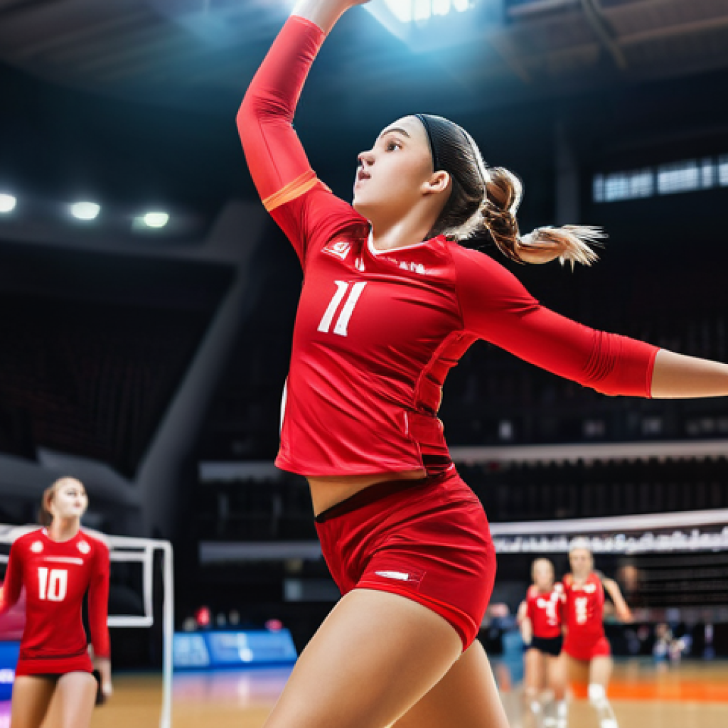
The Red Rush: Dominance and Aggression on Demand
You know that feeling when you walk onto the court, and everything just *clicks*? Sometimes, it’s not just about how well you’ve practiced, but also about the energy you’re carrying, and believe it or not, your uniform color plays a huge role.
I’ve personally felt that surge of confidence when I’ve worn a vibrant red jersey. It’s almost like flipping a switch. Studies actually back this up, showing that red isn’t just a pretty color; it’s associated with heightened aggression, passion, and a genuine sense of dominance.
For a sport like volleyball, where every spike and block demands intense focus and a fierce will to win, feeling that competitive fire ignited by your uniform can be a game-changer.
It’s not just for show; it’s a mental edge that tells you, and everyone watching, that you mean business. I remember one season when our team switched to a predominantly red kit, and our whole attitude on the court shifted.
We played harder, we talked louder, and our opponents definitely seemed a little more on edge. It’s a subtle psychological boost, but in a tight match, those small advantages can make all the difference.
That feeling of invincibility, even if it’s just a perception, can translate into genuinely bolder plays and unwavering determination when the pressure is on.
Blue’s Calm Embrace: Focus Under Pressure
While red pumps you up, there’s a beautiful, calming power in blue that I’ve always appreciated. When I’m in a high-stakes moment, like needing to nail a serve receive or block a cross-court hit, a sense of calm and collectedness is invaluable.
Blue, across the board, is strongly linked to tranquility, trust, and intense focus. It’s the color of the sky and the ocean, invoking a feeling of stability and composure.
For a libero, for example, maintaining an unwavering mental state is paramount. That cool, steady blue can help ground you, allowing you to react with precision rather than panic.
I’ve seen teammates, myself included, visibly relax and find their rhythm when wearing blue. It’s not about being passive; it’s about harnessing a controlled energy that allows for thoughtful decision-making, even in the chaos of a rally.
When you feel centered and confident in your uniform, that focus naturally extends to your game. It’s about being in the moment, making smart plays, and trusting your instincts, all subtly reinforced by the calming presence of blue.
Yellow’s Spark: Energy and Optimism
And then there’s yellow – the ultimate mood booster! There’s something undeniably optimistic and energetic about a bright yellow uniform. It’s like wearing sunshine on the court.
I’ve found that yellow can instantly inject a sense of playfulness and positivity into a team, which is vital for morale, especially during a long tournament.
It’s linked to happiness, alertness, and quick reflexes, making it perfect for dynamic, fast-paced sports like volleyball. When my team has sported yellow, I’ve often noticed a palpable lift in spirits, even during challenging sets.
It reminds you to stay agile, to anticipate, and to bring that vibrant energy to every point. Plus, from a visibility standpoint, yellow is incredibly effective.
It ensures that you and your teammates stand out, which can subtly improve communication and coordination on the court. It’s not just a feel-good color; it’s a strategic choice that radiates enthusiasm and keeps everyone, players and fans alike, engaged and excited.
Sending a Silent Message: Intimidating Opponents with Your Palette
Black’s Bold Statement: Authority and Formidability
Stepping onto the court in black uniforms just *feels* different, doesn’t it? It’s like wrapping yourself in an aura of power and sophistication. I’ve seen countless teams, including my own, utilize black to project an image of unyielding authority and pure, unadulterated strength.
There’s something about the color black that instantly communicates a no-nonsense attitude, subtly telling your opponents that you are a serious contender.
It’s not about being flashy; it’s about being formidable. When you’re facing a team in black, there’s an almost primal reaction, a sense of “these guys mean business.” From my experience, wearing black can genuinely boost your team’s collective confidence, making you feel more streamlined and powerful.
It’s a bold choice that commands respect and, at times, can even influence opponent behavior and, dare I say, even referee perceptions, as studies have shown.
It’s a psychological weapon, giving you an edge before the first serve is even struck, reinforcing the idea that you are there to dominate and nothing less.
Strategic Color Clashes: Disrupting the Opposition’s Focus
Beyond just picking a powerful primary color, there’s an art to using color combinations to create a subtle yet effective visual disruption for your opponents.
Think about it: when colors clash or create a high-contrast visual, it can make it just a fraction harder for the opposing team to track the ball or distinguish between players, especially in the fast-paced nature of volleyball.
This isn’t about being rude; it’s about leveraging every possible advantage. For instance, pairing an unexpected neon accent with a dark base, or using very distinct, almost jarring, contrasting colors, can subtly throw off an opponent’s visual processing speed.
It’s a psychological tactic that, while perhaps not consciously noticed, can contribute to those split-second hesitations or misjudgments that ultimately decide a point.
I’ve always been fascinated by how different color schemes can create optical illusions or simply make it harder to differentiate players quickly. My team once experimented with a uniform that had a very busy, almost abstract pattern in high-contrast colors, and we genuinely felt like opponents were a little slower to react.
It’s all about creating an environment where you have every possible edge, and sometimes, that edge comes from the most unexpected places.
Beyond the Hype: Embracing 2024-2025’s Freshest Uniform Trends
The Allure of Gradients and Geometric Marvels
If you’ve been keeping an eye on the courts, you’ve probably noticed that plain, block colors are taking a backseat. The biggest uniform trends for 2024 and 2025 are all about dynamic visuals that bring energy and personality to the game.
I’m talking about bold gradient fades that transition seamlessly from one vibrant hue to another, creating a sense of movement even when players are standing still.
It’s not just a visual gimmick; these gradients can make a team look incredibly fluid and athletic, almost like they’re in constant motion. And then there are the geometric and abstract patterns – lightning bolts, waves, intricate shapes that aren’t just aesthetic but also lend a modern, edgy vibe to the team.
I’ve always believed that when you *look* modern and innovative, you *feel* modern and innovative, and that confidence translates directly to your game.
These designs go beyond basic aesthetics, helping a team establish a memorable brand identity that stands out in a crowded tournament. My personal favorite from this trend is seeing how teams incorporate subtle nods to their local community or mascot within these geometric patterns.
It adds a layer of depth and storytelling to the uniform that fans absolutely love.
Monochrome Magic with a Pop: Simplicity Meets Impact
But for those who appreciate a cleaner, more streamlined look, the monochrome-with-a-pop trend is absolutely smashing it right now. Imagine a sleek, one-tone uniform – a deep navy or a sophisticated black – but then boom!
A sudden, unexpected splash of neon green, electric blue, or fiery orange on the collar, cuffs, or even as an asymmetric stripe. It’s the perfect blend of understated elegance and undeniable impact.
This trend, to me, embodies modern athleticism: clean lines, high performance, and a touch of daring. It creates a coordinated, professional look that screams unity and focus, yet that pop of color adds a playful or aggressive edge, depending on the hue you choose.
I’ve seen teams nail this, where the accent color is used sparingly but effectively, drawing the eye and emphasizing key design elements without overwhelming the overall aesthetic.
It’s a sophisticated way to command attention and project confidence. Plus, it leaves a lasting impression. When you see a team that’s coordinated but still has that little spark, you know they’ve put thought into every detail, and that attention to detail usually extends to their play on the court.
| Color | Psychological Impact (Players) | Perception (Opponents/Fans) | 2024-2025 Trend Relevance |
|---|---|---|---|
| Red | Aggression, Energy, Dominance, Confidence | Intimidating, Powerful, Assertive | Bold gradients, accent pops, high-contrast combinations |
| Blue | Calmness, Focus, Trust, Composure | Reliable, Strategic, Dependable | Monochrome bases, cool gradient fades, classic pairings |
| Yellow | Optimism, Energy, Alertness, Quick Reflexes | Dynamic, Unpredictable, Vibrant | Neon accents, energetic patterns, visibility booster |
| Black | Authority, Strength, Formidability | Intimidating, Sophisticated, Powerful | Monochrome with pop, sleek designs, base for bold accents |
| Green | Harmony, Balance, Growth, Concentration | United, Fresh, Enduring | Nature-inspired gradients, sustainable materials focus |
| White | Purity, Clarity, Discipline, Tradition | Clean, Strategic, Adaptable | High contrast with darks, crisp base for intricate designs |
Crafting Your Team’s Visual Story: Identity and Fan Connection
Weaving in Your Unique Narrative: Customization as a Core Element

Your team’s uniform is so much more than just game-day attire; it’s a canvas for your collective story. In today’s world, generic templates just don’t cut it.
What truly sets a team apart is its ability to weave its unique narrative, its history, its values, and its aspirations right into the fabric of its uniform.
Customization is no longer a luxury; it’s a core element of team identity. I’ve always been a huge advocate for deeply personalized details – things like subtle sleeve prints with motivational slogans, player nicknames, or even custom numbers that incorporate elements specific to your team’s mascot or local heritage.
I remember seeing a high school team whose uniforms had a pattern subtly inspired by a local landmark, and it just clicked. It created this instant, profound connection with their community and their fans.
When players wear something that truly reflects who they are, their sense of pride and belonging skyrockaps. It transforms the uniform from just clothing into a powerful symbol, creating an emotional bond that transcends the game itself.
This deep personalization is what makes a uniform truly unforgettable and a representation of more than just a sport, but of a shared journey and passion.
From Court to Stands: Building a Brand That Resonates
The impact of a well-designed uniform doesn’t stop at the sidelines; it extends deep into the stands and beyond, building a brand that resonates with fans and the wider community.
A distinct, eye-catching uniform fosters an immediate emotional connection with supporters, turning them into walking billboards and passionate advocates for your team.
Think about it: when fans proudly wear replica jerseys or merchandise featuring your team’s colors and logo, they’re not just showing support; they’re actively participating in and amplifying your team’s identity.
I’ve seen firsthand how a strong uniform design can ignite fan engagement, leading to increased attendance, merchandise sales, and even attracting potential sponsors.
It’s about creating a cohesive visual brand that speaks volumes, instilling pride not just in the players, but in everyone associated with the team. When your colors and design are sharp, memorable, and reflective of your team’s spirit, you’re not just winning games; you’re building a legacy and cultivating a thriving community that stretches far beyond the court.
That feeling of unity, seeing a sea of your team’s colors in the crowd, is truly unmatched.
The Tactical Advantage: Visibility, Contrast, and On-Court Performance
Standing Out: Ensuring Your Team is Seen and Cohesive
In the blur of a fast-paced volleyball match, every millisecond counts. One often-underestimated aspect of uniform design is how effectively your team can be seen and distinguished, not just by the spectators, but crucially, by each other and the officials.
This is where the tactical advantage of visibility and contrast comes into play. Choosing colors that stand out clearly against the court, the background, and even other teams is absolutely vital for quick recognition and seamless communication among teammates.
I’ve been in games where opposing teams wore similar shades, and it genuinely made it a fraction harder to track passes or anticipate plays. On the flip side, when your team wears bold, contrasting colors, it creates a visual cohesion that makes your movements appear more synchronized and your team look more organized.
Think about the stark contrast of white against a darker court or a vibrant neon yellow against a deep blue. It helps with spatial awareness, reduces confusion, and can even influence how quickly a referee makes a call.
It’s not just about looking good; it’s about optimizing performance through clear visual cues that ensure every player is easily identifiable and every move is tracked.
Comfort is King: When Aesthetics Meet Functionality
As much as I love a visually striking uniform, I’ve learned the hard way that if it’s not comfortable, it hinders performance more than any psychological edge can boost it.
Aesthetics are important, but functionality is king, especially in a sport as physically demanding as volleyball. The best colors and designs in the world mean nothing if the fabric is scratchy, restrictive, or doesn’t breathe.
Lightweight, moisture-wicking materials are non-negotiable for serious play. I’ve experienced uniforms that felt heavy after a few points, or worse, trapped heat, making me feel sluggish and distracted.
Those are the moments when a beautifully designed jersey becomes a liability. For 2024-2025, there’s a strong emphasis on advanced fabrics and slim-fit jerseys that allow maximum freedom of movement while looking professional.
It’s about finding that sweet spot where your uniform not only looks amazing but also feels like a second skin, allowing you to move, jump, and dive without a single thought about discomfort.
When you feel good in what you’re wearing, you play better – it’s that simple. It’s investing in your performance as much as your appearance.
Making Your Mark: Longevity and Return on Your Uniform Investment
Timeless Choices: Investing in Enduring Style
Let’s be real, outfitting a volleyball team isn’t cheap, and nobody wants to invest in uniforms that look dated after just one season. That’s why, when I advise teams, I always emphasize the importance of making timeless choices that offer enduring style.
While trends are fun, some color combinations and design elements simply have a longer shelf life. Think classic pairings like navy and white, or black and gold – they exude sophistication and never really go out of fashion.
Investing in a high-quality, well-designed uniform isn’t just about the immediate season; it’s about creating a look that your team can be proud of for years to come.
I’ve seen teams cling to beloved uniform designs for multiple seasons, often just refreshing them with minor tweaks or new customization details. This approach not only saves money in the long run but also builds a sense of tradition and recognition.
When your uniform consistently looks sharp and relevant, it reinforces your team’s stable and reputable image, which is invaluable for long-term branding and attracting new talent.
It’s about making a smart investment that continues to pay dividends long after the final whistle.
Beyond Game Day: Maximizing Your Uniform’s Value
The value of a well-chosen uniform extends far beyond just game day performance. It’s about maximizing your investment by recognizing that these garments serve multiple purposes, both on and off the court.
Think about the potential for merchandising: a striking uniform design can easily be adapted for t-shirts, hoodies, and other fan gear, creating an additional revenue stream and strengthening community ties.
I’ve seen teams with particularly cool designs sell out their fan apparel because everyone wants a piece of that team spirit. Furthermore, a high-quality, memorable uniform can become a powerful recruiting tool, attracting talented players who want to be part of a team that looks as professional as it plays.
It’s an unspoken promise of quality and dedication. And let’s not forget the symbolic value: a well-maintained, classic uniform can be passed down or even displayed, becoming a tangible piece of team history.
It fosters a sense of legacy and pride that builds over time. When you choose uniforms with an eye towards longevity, versatility, and broad appeal, you’re not just buying jerseys; you’re investing in your team’s image, its future, and its lasting impact.
Wrapping Things Up
And there you have it, folks! It’s truly amazing how much thought and strategy can go into something as seemingly simple as a volleyball uniform. What I’ve really learned through my own journey and seeing countless teams evolve is that a uniform isn’t just about covering up; it’s a powerful statement. It speaks volumes about your team’s spirit, its identity, and even its tactical approach before anyone even serves the ball. I mean, who would’ve thought that a shade of red could ignite such a competitive fire, or a calming blue could sharpen your focus under immense pressure? It’s a blend of art and psychology, really, and embracing these insights can genuinely elevate not just your team’s look, but its entire presence on the court. Finding that perfect balance between style, psychological impact, and sheer comfort is where the magic truly happens, turning your team from just players into a unified, formidable force.
Useful Info to Keep in Mind
1. Color Psychology is Real: Don’t underestimate the impact of colors like red for aggression or blue for calm. My advice? Experiment with different hues in practice to see how your team’s energy shifts. You might be surprised by the subtle but significant changes in morale and performance!
2. Trends Aren’t Just for Fashion Weeks: Staying current with uniform trends like gradients and geometric patterns isn’t just about looking good; it makes your team appear forward-thinking and innovative. Trust me, first impressions matter, and a modern kit can give you an immediate edge.
3. Comfort Truly is King: You can have the most striking design, but if the fabric isn’t breathable or restricts movement, it’s a huge disadvantage. Always prioritize moisture-wicking, lightweight materials that feel like a second skin. I’ve personally seen how uncomfortable uniforms can sap energy faster than any tough opponent.
4. Identity Beyond the Court: Your uniform is a branding tool! Customization with unique team narratives, local elements, or even player nicknames fosters deeper connection with fans and the community. This creates a lasting legacy and boosts fan engagement far beyond game day.
5. Think Long-Term Investment: When choosing uniforms, consider timeless designs and durable materials. This not only saves money in the long run but also builds a consistent, recognizable team image that attracts talent and strengthens your brand for seasons to come. A classic look never goes out of style.
Key Takeaways
From my time around the court, I’ve seen firsthand that a uniform is a multi-faceted tool. It’s not just about looking sharp, though that’s certainly a bonus! The colors you choose can genuinely influence player psychology, from boosting confidence to sharpening focus, and even subtly intimidating opponents. Beyond that, a well-designed kit is a powerful extension of your team’s brand, fostering unity, attracting fans, and making a memorable statement. Embracing current trends while prioritizing comfort and smart, long-term investments ensures your team performs at its peak, both physically and psychologically. It’s all about creating an identity that resonates, making every player feel a sense of pride and every fan a deeper connection to the game.
Frequently Asked Questions (FAQ) 📖
Q: How do specific colors actually impact player performance or team psychology on the court?
A: This is such a fantastic question, and one I’ve pondered myself after countless matches! You know, it’s easy to dismiss uniform colors as just “looking good,” but honestly, I’ve seen firsthand how a well-chosen palette can genuinely shift the entire vibe of a game.
Think about it: when you step onto the court in a vibrant, confident color, doesn’t it just feel different? My experience tells me that colors can subtly influence everything from player confidence to opponent intimidation.
For example, I’ve noticed teams wearing bold reds or deep blues often project an aura of power and determination. It’s almost like a psychological boost for us and a slight mental nudge for the other side.
Conversely, I’ve played on teams where the colors felt a bit lackluster, and it’s surprising how that can seep into your overall mindset. It’s not just about what you wear, but how that color makes you feel and how it’s perceived.
It’s truly a secret weapon in the mental game of volleyball!
Q: What are the hottest volleyball uniform color trends for 2024 and 2025 that my team should consider?
A: Oh, this is where the fun really begins! Having kept a close eye on the sidelines and chatted with so many designers over the years, I can tell you that 2024 and 2025 are all about making a statement that’s both stylish and strategic.
Forget boring, predictable combinations! What I’m seeing everywhere are bold gradients that flow seamlessly from one eye-catching hue to another – think electric blues fading into vibrant purples, or fiery oranges blending into deep maroons.
It just looks so dynamic and energetic! Monochrome pops are also huge; picture a sleek, all-black uniform with just a powerful splash of neon green or fuchsia on the trim or a specific design element.
It’s incredibly chic and modern. And honestly, one of my favorite emerging trends is personalization. Teams are moving beyond just a standard logo; they’re incorporating subtle patterns or even abstract designs that truly reflect their unique team spirit or local identity.
It’s not just about looking good, it’s about telling your team’s story through color and design, and I absolutely love that!
Q: Beyond trends, what practical steps should my team take to choose the best color scheme that really works for us?
A: This is where we get strategic, and trust me, it’s worth the effort! While staying on-trend is fun, choosing the right color scheme for your team is about more than just what’s “in.” First things first, gather your team and truly talk about your identity.
What kind of energy do you want to project? Are you fierce and competitive, or more about speed and agility? I’ve found that starting with a team meeting to discuss your core values can surprisingly guide your color choices.
Secondly, think about visibility on the court. Some colors, while cool, might blend in too much with certain court backgrounds or even other teams. My experience says that contrasting colors often help with team cohesion and make you stand out.
Thirdly, and this is a big one, consider the psychological impact. Do you want to project power (like reds or dark blues), or maybe calmness and focus (like certain greens or light blues)?
Finally, don’t forget comfort and practicalities like color retention after washes. I’ve made the mistake of picking a color that faded quickly, and let me tell you, it’s a bummer!
My advice? Get a few samples, even if it’s just swatches, and see how they look in different lighting. It’s all about finding that perfect blend of aesthetics, psychology, and practicality that makes your team shine!
📚 References
Wikipedia Encyclopedia
구글 검색 결과
구글 검색 결과
구글 검색 결과
구글 검색 결과